This is a place to keep up to date with current events around the GTA. We will be sharing great sources of information and interesting articles. Our promotional offers contests and discount codes will be posted here too.! keep coming back to see what's new at Efficiency Homes and Landscapes.

Sunday, 20 January 2013

How To Work With a Landscape Pro

This article offers great tips on how to decide what you need when hiring a landscape pro!

http://www.houzz.com/ideabooks/2115232/list/How-to-Work-With-a-Landscape-Pro

How to make your home more energy efficient

Here's some tips on how to make your home more energy efficient and save $$$ on heating

http://greenhomeguide.com/know-how/topic/4?gclid=CIintq-V97QCFUZgMgod_3QAhg

Saturday, 19 January 2013

Regent Park Aquatic Center

Regent Park’s splashy new aquatic centre: Hume

Published on Friday November 23, 2012   

Regent Park

MacLennan Jaunkalns Miller Architects The Regent Park Aquatic Centre is far more than just a pool; it's a beautiful modern facility designed to be enjoyed.
Image
By Christopher HumeUrban Issues, Architecture
1 Comments
If God is in the details, the best place to look for Her right now might be the new Regent Park Aquatic Centre.
In any part of town, this facility would stand out; but on Dundas St. E. in the middle of a failed postwar social housing community, it looks spectacular. Indeed, it would be hard to find a more convincing piece of contemporary architecture in the city or beyond.
Designed by MacLennan Jaunkalns Miller Architects (MJMA) of Toronto, this is one of those rare projects where everything comes together without fatal compromise, civic misgivings or any obvious damage inflicted by value engineers. Exquisitely detailed yet boldly gestural, this is a recreational amenity taken to a whole new level. Though supremely practical, it’s also a powerful statement about the beauty of utility.
The centre, which opened quietly last weekend, represents the latest installment in the revitalization of Regent Park, itself a rare instance of urban enlightenment in a city that all too easily forgets it’s a city. Though the remake has years to go before it sleeps, already things are changed beyond recognition.
The original housing, boxy and undifferentiated, is being replaced by glass-and-steel buildings, low- to high-rise, that address human needs rather than some imagined set of priorities. And by mixing market-priced units with subsidized apartments, Regent Park’s ghetto-like aura has finally started to lift.
MJMA’s contribution will go a long way to making that happen. Set back from the sidewalk on the north side of Dundas, east of Parliament St., it is an elegant two-storey structure that alternates between black and white, transparent and opaque, hard and soft.
From the street, the centre presents a sleek facade of glass, wood and blackened zinc. Through the glazed exteriors we see two large pools and the various features that make the place less an athletic facility than a neighbourhood recreation centre. Until now that has meant concrete-block boxes designed to be cheaply constructed and easily maintained. They have about them the air of places intended to be used more than enjoyed.
Not Regent Park; while there’s no hint of luxury here, there is an impressive attention to detail. These smaller points enable the project to embrace users and engage them in an experience that anticipates their every need. A good example is a wall of hairdryers, arranged Grand Salon-style, to accommodate both short and tall.
Then there are the “universal” change rooms. They’re filled with cubicles available to men and women and everyone else. The reality isn’t nearly as daring as it may sound, but in a time of paralytic political correctness, these non-segregated facilities represent a welcome loosening of the social fears that have constrained Toronto for decades.
The centre’s two pools — one for laps, the other play — can be glimpsed through glass walls. On the west side, they connect to a park now under construction. In fact, these walls can be opened to allow direct access from outside. In a risk-obsessed jurisdiction such as Toronto, that’s something of a minor miracle. So are the slide, Tarzan rope, bubblers, hot tub, and so on. Even the water is warm.
Because of these measures and others, Regent Park is a seamlessly integrated element of the public realm. MJMA partner David Miller calls the centre “a pavilion in a park” and he’s right. Older pools — think of Sunnyside — were hidden behind large castle-like walls. Newer ones were set off by chain-link fencing.
Regent Park may be the first such facility to treat users as adults; it provides them with opportunities and access that earlier versions wouldn’t have dared. If this project is any indication; Toronto must be growing up.
Architecturally speaking, the highlight is the massive cedar-panelled roof structure that cuts through the building from end to end. It reads as a single piece, curved like an upturned boat, full of warmth to soften the hard surfaces of glass, tile and concrete.
“People’s perceptions of what a pool can be are changing,” explains project architect Troy Wright. “This is the culmination of a lot of things.”
Miller calls it the “next generation” of aquatic facilities: “It has all the things we like to do. It’s light, bright and open. It has a lot to do with the park.”
That park won’t be ready until the fall of 2013, but already it’s clear how it will embrace the centre on three of its four sides.
Mostly though, MJMA has produced an outstanding piece of architecture that reminds us the city is about more than acceptable mediocrity and rigid adherence to arbitrary regulations and unfounded assumptions. The modest $14.7 million budget notwithstanding, the firm has managed to balance the big moves and the finer touches to create a thing of remarkable power. The cantilevered walls, dramatic roof (green on top) and the counterintuitive geometry create an impression of dynamism, solidity and openness.
“It’s quite a joy,” says pool supervisor Gary Sanger, who credits local councillor Pam McConnell with keeping the project alive and even making it better than initially planned. “People love it. The architects listened to what we said. We’re very pleased.”


A RAD condo renovation


Cross-posted from No Mean City, Alex’s personal blog on architecture
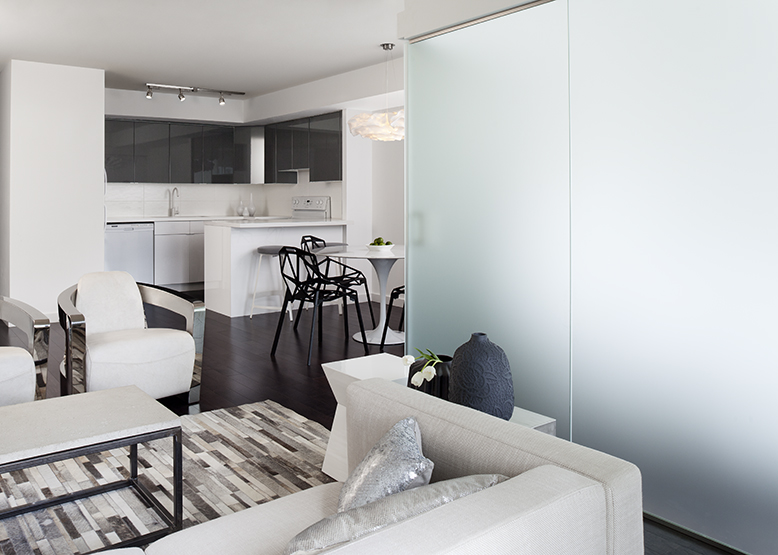
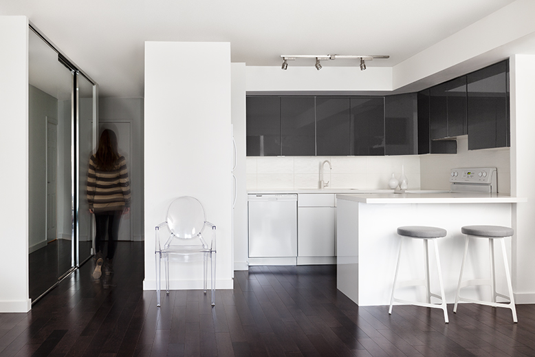
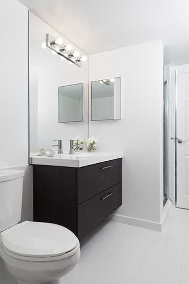
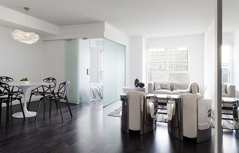
Welcome to the age of the fixer-upper condo, the older apartment that needs some work. Here’s one that has been done, beautifully, by Toronto’s RAD Design: a 600-square-foot unit in the St. Lawrence Neighbourhood that architect Golbou Rad renovated for just $30,000 and sold at a profit.
I don’t usually cover projects built to be flipped. But this one sets a very interesting example. Why? There’s tremendous untapped value in Toronto’s older apartments.
There are no bargains if you are looking for a well-designed apartment in this city. The boom in highrise and midrise condominiums is being driven by good design – which means tight space planning, contemporary finishes, decent millwork and a tricked-out sales centre to market it all. But these things cost money, and the apartment you get will be small.
RAD’s project represents an alternative approach, renovating a condo from the boom of the 1980s.

In Toronto these buildings are generally unattractive and not well-built. But they’re cheap and the apartments are big. Rad, an architect who worked for Teeple Architects before going solo, saw a business opportunity. “I spoke to some real estate agents, selling the same unit layout,” she tells me. “They said the interest came from younger, fresh out of university professionals that are moving to the city to start their career.” There are many speculative renovations happening in this building, but some of them had a “very Italian-villa” aesthetic and poor space planning.
Her approach is different. “My style and focus is always very modern and minimal. I don’t like clutter. I believe that life will add enough clutter to the space – clothes, books, pets, accessories, family photos, etc. – so I always keep my designs clean and minimal and the furniture I select is always simple, structured and elegant.”
I don’t always favour this type of interior design, but here, it works well: it’s generic but tasteful. And the layout, which is now wide open, is much improved.
I don’t want to knock the condo industry’s marketing apparatus. Developers’ interest in design is a great thing: today’s apartments are much better made than those of a decade ago. And the trend has opened the door for architects, good interior designers and design-savvy retailers to find a broader audience. But 400 square feet is just not enough for most singles or couples to live comfortably. 600 square feet is. If you do it right – like this. I hope young architects and designers will find clients to tackle projects like this. It’s a ripe opportunity.
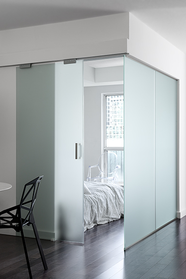
The big move is the glass wall that divides off the bedroom. In Rad’s words: “I squared off the corner, added a very thin stainless steel frame only to the top and bottom for stability, and used acid etched translucent glass for privacy. The edges of the glass wall, on the living room side, are exposed and cut to fit around the baseboard. The left side extends slightly past the door and the wall above it, as an added detail. And to add a ‘loft’ touch, I used a wall mount system for the glass sliding door (barn door style) with stainless steel hardware.”
“I think the colour of that glass really added to the space and helped modernize the space tremendously.”
 
Bathroom-001_Final


Thursday, 17 January 2013

Our new website is done!!! Come take a look at www.efficiencyhomesandlandscapes.com or www.efficiencyhomesandlandscapes.ca let us know what you think.
We will be adding news feeds and promotions that will be available for the up and coming gardening and landscape season!